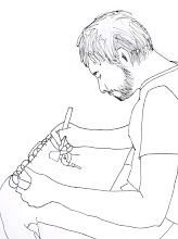
Nothing too new in this set. The sketch in the upper-left corner comes from a painting of Jesus I saw in Sunday School class.
The upper-right figure doesn't look too much like the person I was trying to draw, but I actually LOVE how I did the hair.
The guy in the middle illustrates that my problems with drawing hair extend even to facial hair.
The guy in the bottom-right probably best resembles the person I tried to sketch of all the attempts I've made thus far. So I'm kind of proud of it.
Meanwhile, the woman I modeled the bottom-left sketch after looks very little like Hillary Clinton in real life, so I can call that one a failure.
The top two figures don't look a whole lot like the people they were based on. The guy's got a bit of a cut-off skull (his head's too squished). The sketch of the girl has a bit too much of a turned-up nose.
I tried to cartoonize both of them, and wound up with some extras from the Children of the Corn. We'll just move on now.

I recognize that I need to start sketching more inanimate objects as well as people, so we have a REALLY bad stool here, a fairly decent hanging lamp, and a bookshelf that I got tired of drawing books on, so I just gave up by the bottom shelf. People are SO much more interesting to draw.

In each of the corners here are cartoon people sketches I did without a model. The upper-left one I'm particularly proud of. For some reason, he looks like Guile from Street Fighter 2. Don't know why I drew Guile, and I REALLY don't know why I gave him serpent eyes. I think I was just experimenting.
I've been working so much on sketching heads in 3/4 view that I've neglected to draw front-on faces. Both of the faces above are based on characters from The Office. The one in the bottom left is Steve Carell as Michael Scott on the front of the Season 2 DVD boxed set. I think it's a fairly accurate depiction.
For the upper-left face, I paused the DVD on a close up of Jenna Fischer as Pam Beesley (sigh). Yeah, I do recognize that doesn't look a bit LIKE Pam or anyone else. We can now add TEETH to my list of things that I hate to draw.

I'm proud of this sketch: my first full-body person that DOESN'T make me cringe when I look at it. I designed him myself (which is probably why he looks a little bland). The hands still aren't quite the right size, but they're much better. Much, MUCH better.
I think I've pretty much figured out how I'm going to do cartoon eyes from here on out. They don't seem to look a whole lot LIKE eyes, but they work for me. My only concern is that the style draws too much from the big-eyed sparkle-faces you see in Japanese animation.
I need to get a better sense for proportions, especially from the front-view. Once again, I wound up drawing a face that I had to plant smack in the center of a rather chunky face to make the character even look HUMAN.
Oh, and I draw ties because they make the sketch LOOK better, but are really easy to draw.
And is anyone else surprised I hadn't drawn Batman until now?
Man, I love Batman even MORE than I love alliteration. Combine the two -
"Basically, Batman beats baddies by belligerently bashing their brains."
- and I'm in heaven.


2 comments:
My husband LOVES Batman. I mean, LOVES him. Especially Batman: The Animated Series. He and Sam run around pretending to fight crime in our living room a lot.
Your drawing is improving just from the last few posts. Great job!
Thanks, Mitzi! I appreciate it.
Post a Comment