Saturday, February 27, 2010

Daily Sketches


2.23.10 - This isn't mine. I stole this picture from a Captain America comic. She was a news reporter standing on the side.

The comic only portrayed her from the hips up. I added the feet. And they are pretty terrible.

I don't know WHO picked this chick's outfit. A winter coat with a turtleneck I can understand... but why wear warm clothing that exposes your midriff? I don't get it.


2.24.10 - Not much to say about this one.

Integrals are about the only part of calculus I still remember.


2.25.10 - I remember trying to draw a woman with HUGELY exaggerated hips... I wound up with this sketch, where the hips... actually look about right.

So I was incredibly proud of this sketch, went and showed it off to some friends, who promptly asked, "Where are her boobs?"

Why are women so complicated?


2.26.10 - Andrew likes the steam.


2.27.10 - My sister-in-law saw this sketch and promptly asked, "Why isn't she wearing a bra?"

I tried to exaggerate the "womanly features," as I did before, and I wound up with this bra-less disco-dancing weirdo.

Thursday, February 25, 2010

A Poem: Pornogratification

The poetry slam on Monday night reminded me of a poem I wrote way back when I actually WROTE poems with heavy rhyme and rhythm schemes. This may, by the way, be the most unoriginal poem I've ever written. The entire time I wrote, I had the rhythm to the Red Hot Chili Peppers song "Californication" running through my head. Even the title came from the Peppers, although I did have a little help from the band Extreme (of "More than Words" fame).


Anyway, this is a poem I've pretty much abandoned, so I've got no qualms about posting it on the internet where everyone can judge my artistic ability based solely on this one rejected idea. Enjoy!


Pornogratification
To you, born and raised and by love depraved,
We’re selling you a new sensation.
For dance-floor losers, all you beggars and you choosers
It’s the doctor’s medication.
Stick it to your tongue, and then, oh brother, when you’re done
You’ll be begging us for re-sedation
A silicon injection that’s been boiled to perfection.
It’s a picture perfect presentation.

A late-night fever that’ll burn until you leave her
It’s a spin inside an elevator.
A high-heeled killer gives a dopamine thriller
But don’t last in the refrigerator.
Take it for a spin out and your urges gonna win out,
You’ll need breathing with a respirator.
Our seasonal line up’s guaranteed to keep you tied up
In a color wheel spun theater.

It’s a crackpot innovation for a hedonistic nation
It’s a dollar store revolution.
For a flashy 2D lover drive your senses undercover
And throw Romeo an execution.
To all you Barbie doll believers, know that you’re born to believe us
We’ve got your counter-convolution.
While the good stuff’s overflowing, line up for the final showing,
Soak up the loner’s last solution.

Wednesday, February 24, 2010

S.R. Braddy and the Poetry Slam

For a self-professed poet, I sure do a whole lot of “not writing.” Why, just the other day, I didn’t write a poem about a conversation I didn’t have with a friend I haven’t seen in several years. I didn’t sit down at my not-computer, turn on the not-screen, and write a bunch of non-words on an invisible page. I then didn’t pause for a second, re-unread what I hadn’t written, and de-revise what wasn’t on the page until I hadn’t churned out a literary anti-diamond.

All that means is that I played Playstation while thinking to myself, “I should really be writing something right now.”

I had some pretty big plans at the start of 2010 for my writing, but I seem to have lost a lot of the desire I once had for poeticizing (a word I didn’t know existed until I wrote it). I think a lot of my creative energy has gone from poetry to the sketches I’ve been working on – which is kind of a shame. I mean, I like drawing, but I’m definitely much better at poetry than I am at art. Of course, you could say that I’m pretty bad at both of them, since I’m neither a Shakespeare nor a DaVinci. To that, I say, “Hey… that hurt.”

I recently rekindled my interest in poetry by attending a Poetry Slam on Monday night. The slam reminded me something I’d long forgotten – poetry is a performance. Sure, most poems are written on paper, but that doesn’t mean their meant to be read in silence over Sunday breakfast while light pours in through the window, highlighting the dust specks dancing on the air to the tune of children laughing in the front yard. I mean, I don’t even HAVE a front yard.

The poets at the slam were INTENSE – but not so much that I couldn’t take them seriously. In fact, I think I take them seriously because of how seriously they didn’t take themselves. They laughed, joked, cheered and heckled – all of which I can really get behind.

And, when they read their poetry, they PERFORMED. They beat their fists to the tempo of the text they spat. Their heads bobbed with energy, sometimes even drooping to capture the emotion.

Now, the poems weren’t all perfect. Some were less refined than others – I got the sense that many put more effort into showing off how they could move to their poetry than they did into what they would actually say on stage. And a lot of people seemed to confuse poetry with political preaching – not that there’s not a place for political opinion in poetry, but, if you can’t say what you want to say in a poem artfully, you’re better off writing a letter to the editor.

I felt particularly bad for a gifted man who took the stage and expressed all the fears he had, as a parent, for his children, pulling examples straight from the headlines of violent crimes against minors. His words were powerful, his fears palpable – then he started throwing in descriptions of laws passed in the name of child victims. The effect could have been powerful, but his description of an Amber Alert seemed to come straight from the Wikipedia page – all fact, no art.

I walked out of the slam feeling like a bad poet – not just because I hadn’t written much new poetry in a while, but because the poetry I wrote simply didn’t compare to what I heard delivered on that stage. These were poets who had a real ear for the rhythm of words and the harmony of rhyme – a characteristic often missing from my own verses, which often seem to me to be more like quaint anecdotes than actual poems. Oh, and their poems were much longer than mine. My poems would probably take about thirty seconds to perform, while some of these poems lasted a full three minutes (one poem went for ten, but… well, it wasn’t actually that good).

The conclusion I ultimately came to is that I’m not THAT kind of poet. These writers modeled their work more after the Beat poets, while my poetry is more akin to… some… other poets… that you’ve never heard of… that are awesome and… stuff.

Still, I felt inspired by the experience. I got a couple of ideas from listening to the poetry slammers perform that I may have to turn into full poems some day. I also think I might have to “steal” a few poems that I think I could actually write better. I’ve missed the feeling of being a writer – that false sense of intellectual superiority that comes with the ability to type a clever rhyme on a page.

What I think I’m missing, I think, is a community – and this may be the reason I’ve been so successful with my sketches and NOT with my writing. I have a goal to do a sketch a day, and I have two or three friends that keep tabs on me (and I on them) to make sure I get the sketch done. The writing, though? It’s just me.

I don’t think I’ll ever be part of the Salt Lake City Poetry Slam community – I mean, my hair’s messy, but I don’t have dreadlocks – but I’ll definitely go back for another reading.

Tuesday, February 23, 2010

Daily Sketches


2.19.10 - One of the first women drawings I've ever done free-hand that I'm not totally horrified with.

A few experiments here: the hair, which turned out mostly well (although the girl's bangs almost make her look like she's wearing a ball cap) and the outfit. I find that the sketches I'm proudest of have more attention to the clothes being worn, so I tried to add more detail - layers, rolled-up sleeves, etc.

Also, this chick's got a HUGE head and really tiny arms.


2.20.10 - Dude with a crew cut and a wife beater. Oh, and more really tiny hands.


2.21.10 - Here's another woman sketch that I'm not horrified with. I don't like how the hair turned out, but I was working without a model.

My friend commented that I finally got the hips on the woman right - but I was actually trying to draw a big skirt.

I colored in a lot with my pencil, which caused a whole lot of smudging. Some of it was intentional. The overall effect - less than desirable. But, as an experiment, this sketch is awesome.


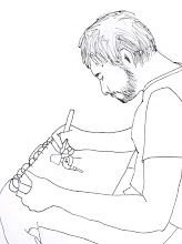
2.22.10 - Drew this guy while at a poetry slam. I tried to foreshorten the right arm some - and pretty much failed at it. And by the time I got around to drawing the face, I pretty much gave up.

I should have drawn the hoodie the guy was wearing, but I decided not to, for some reason. Hoodies are pretty fun to draw.

Thursday, February 18, 2010

Daily Sketches


2.14.10 - I set out to draw a guy with a sword. I didn't mean to make his hands so freakishly small.

The hearts were an afterthought.


2.15.10 - I hoped to repeat my success from my 2.13.10 sketch with a female subject. I don't think I did that well.

I still tend to draw women very broad in the shoulder, and I demonstrate a remarkable fear of all anatomy not shared with the masculine sex.

I decided to draw lace on her sleeves. Then I remembered I have no clue how to draw lace.


2.16.10 - Had a lot of fun drawing this guy. I don't know why exactly I opted for the poofy shirt, but I think this works.


2.17.10 - Another Village Inn sketch. Not my favorite. Not even close.

The apple pie and hot chocolate I had while working, though, were amazing.


2.18.10 - Amazing what you can do with half an hour on your lunch break.

I hate this guy's feet. I mean, HATE them. They're hideous, and weird, and they don't even look like real feet.

The thing I'm proudest of with this sketch, though, is that I drew everything as is on the page. I didn't flip the sketch upside down to get the face right - I drew it upside down from the beginning. I think it's awesome.

Wednesday, February 17, 2010

Highs and Lows

Quick life update:

HIGHS

1. I got the opportunity to perform with the Jesters Royale this past weekend. Highlights: I got to play a slinky feminine lounge singer at a truck stop (“Come on, fellas. You know that I’m single. Come to the convenience store and buy me some Pringles”) and a skittish second-date shy Jonah the prophet (“It came to pass that I fled from the Lord, and I was swallowed by a great fish, wherein I could not get reception upon my Sprint wireless device”).

2. Drawing is awesome. That is all.

3. New Year’s goals are coming along pretty well. Haven’t missed a Daily Sketch™ yet. The writing’s coming along less successfully, but still pretty well. I’ve nearly finished two of the six books I’m to read by the end of the year.

4. I’ve been getting a lot of compliments about my voice recently – from patients at the psychiatry clinic to random eavesdroppers at church. Sincere, unsolicited compliments always feel nice.

LOWS

1. Last week, I had one of the worst days of my work life. Eight days later, and I’m STILL pissed off about it.

2. Spoke to a girl at FHE the other day. The activity: making construction paper masks for a masquerade ball. The conversation starter: “So, blue construction paper, huh?” The conversation ender:

…actually, that was it, too.

3. In the past few months, I’ve kissed more guys than girls. They’re all stage kisses, so none of them count in the grand romantic tally of life… but, for a heterosexual male, that’s still a bit of a downer.

Tuesday, February 16, 2010

Things I'll Love Forever: Pushing Daisies

So, Valentine’s Day… Normally, I don’t really get all angsty about Cupid’s annual hunting trip, but this past weekend got me feeling a bit down. Now, I don’t actually know what single guys DO with the “lonelies”… probably involves small furry animals and shotguns. I decided to turn to one of those “Things I’ll Love Forever”: Pushing Daisies.


1 – There’s a lot to be said for a good “high concept” well-executed. For those not in the know: a pie-baker with the power to raise the dead for 60 seconds at a time teams up with a private-investigator-slash-knitter and his reanimated girlfriend to solve murders by reviving the victims and asking who killed them. The premise is creative, a bit quirky, and utterly fantastic.

2 – Despite my rugged and rough-chiseled exterior, I’m a sucker for a good romance. The romance in Pushing Daisies is one of the best I’ve ever seen. Ned – the aforementioned baking resurrectionist – brings his girlfriend Charlotte “Chuck” Charles back to life. Of course, the conditions of Chuck’s resurrection prevent her from ever being able to touch him again without dying. A love story where the lovers can’t actually touch is heartrending and touching in a way no other romance can achieve.

3 – Every single character in the show – from the money-loving egocentric Emerson Cod to Charlotte Charles’s introverted aunts, the Darling Mermaid Darlings – is extraordinarily and lovingly neurotic, but in such an artistic fashion that none of them come off as one-dimensional. In fact, every character – even the bit players with one appearance in a single episode – is so well-crafted that they are instantly and completely developed.

4 – Olive Snook – played by Kristen Chenowith – gets a musical number once every couple of episodes, and… DANG, that girl has pipes!

(I know I said the same thing about Amy Adams. So I guess I have type).

5 – Pushing Daisies has some of the best and brightest visuals I have ever seen in any television show. They’re the closest I’ve ever seen to live action emulating a cartoon in a totally classy way.

6 – Jim Dale’s narration is some of the classiest voiceover work I’ve heard.

7 – I’m a sucker for quality writing, and Pushing Daisies is brilliant. Every line of dialog is peppered with enough spicy alliteration and witty metaphor to make even the bookwormiest of English majors weak in the knees.

Alas, Pushing Daisies died young, leaving plot-threads dangling like Chthulhu’s accursed tentacles. Even so, I’ll love it forever.

Saturday, February 13, 2010

Daily Sketches


2.10.10 - Cop-out sketch. Drew it at Village Inn while waiting for my pie.


2.11.10 - Frank Quitely is one of the best artists working in comic books today. I decided to copy his take on Lex Luthor from All-Star Superman, which is one of the best comics I've ever read (and I don't even LIKE Superman).

Drawing the lab coat flowing in the wind was a lot of fun. I think one of the reasons a lot of my earlier drawings feel so flat is that there's not a lot of "personality" to the clothing. The folds and textures are pretty engaging to study and copy.


2.12.10 - I drew the guy on the left during my lunch break at work. The shoes I just drew hastily when lunch was almost over, but the rest of the guy... yeah, I liked drawing this guy.

I got so excited by the fun I had drawing that I decided I wanted to add another character on the other side of the page. I drew the girl during intermission for The Odd Couple at the Empress Theatre. It... didn't go as well. She looks like she's falling over.


2.13.10 - I decided to try to draw consistent-looking characters from different angles. Here's my first effort.

The hair on this guy was a BLAST to draw. I modelled it after the 'do one of the guests at my friend's wedding sported.

I can't help but feel that the sweater makes this guy look fat... especially from the front view.

It's not a PERFECT likeness between the original and the profile, but I'll be darned if it's not still pretty good.

Thursday, February 11, 2010

Tuesday, February 9, 2010

I Love Nordstrom's

I have a confession – I’m starting to fall in love with Nordstrom’s catalogues.

We get a Nordstrom’s catalogue sent to our office every month or so. It’s addressed to some Kent guy, but it’s also got one of those “or current resident” caveats, so I figure I’m justified to just throw them away. Well, one day, I happened to take a closer look at the model on the cover of the catalogue, and… yeah, I decided I just HAD to draw her. Wound up being one of the best sketches I’ve ever done.

We got a new catalogue today – no interesting cover model, but there were PLENTY of pictures on the inside. There’s something kind of fascinating about the pose a model strikes when being photographed – a good photograph has some of those same ethereal qualities as a good, abstract painting.

I was a bit surprised to find no photographs of men in the magazine. I’ve never shopped at Nordstrom’s – and now I guess I know why.

Now, the hyper-distorted, super-skinny model that normally graces a photo shoot probably doesn’t really represent the majority of women I’ve met. There is that hint of being TOO skinny – if you know what I mean. From an aesthetic perspective, I can see the appeal. A lot of art seems to be using form to express emotion. What better form could there be for capturing human emotion than the human body, even if that emotion is “I really want that blouse.”

Distortion seems to be a powerful tool in expressing emotion. An extremely droopy face expresses sadness a bit more overtly than a simple frown. I think that’s why models look “attractive”: the long, skinny limbs appear graceful because they are so exaggerated, almost cartoony.

I do have one question about the models in the Nordstrom’s catalogue, though: Why the heck do they all have their mouths open partway? Seriously, every single one has her mouth open just enough to show their front two teeth. They’re not even really smiling, just standing around slack-jawed, showing two teeth, and no more.

My bet? They don’t have molars.

Daily Sketches


2.3.10 - I'm okay with how this guy turned out... from the shoulders up. I modeled a lot of this guy's build after the Hellboy comic character (hence the goggles on his forehead). In that respect, I got a lot of this down right.

From the waist down, things get problematic. I guess I forgot that guys have curves, just like girls do. Well, not JUST like girls...Moving on.


2.4.10 - A rough sketch, but I'm actually pretty pleased with it. I guess I SHOULD have drawn a chair that he's actually sitting on. Oh, well.

If I felt like getting into more detail, this guy would TOTALLY have a Hawaiian-print shirt.


2.5.10 - Scott Pilgrim. 23 years old.

Scott Pilgrim is actually a character from a comic series by Bryan Lee O'Malley. Not my favorite, but somehow INCREDIBLY memorable. O'Malley draws with a strong Japanese manga influence. I tried to Americanize the artwork a little bit in my take on the character, only to be told I draw with a pretty strong Manga influence, as well.

Oh, well. I still like this one!


2.6.10 - David watches from above...


2.7.10 - Drawing long hair on women, for some reason, intimidates me.
I feel at this point like I'm hitting a plateau with my free-style (un-modeled) figures. I need to find something to kick it up a notch, so I feel like I'm making progress again.


2.8.10 - Heh.

Based this picture on a promotional photo of myself taken for the Jesters Royale website. I decided to try to match the shadows on the photo as well as the lines. So I drew myself, but, for some reason, it looks like I'm in blackface.


2.9.10 - Ah, Nordstrom's! How I love your catalogues!

The main reason I picked this particular model to draw was for the fantastic design on the girl's dress. They actually got pretty complicated, and I only had an hour to draw on my lunch break, so I didn't really do the pattern justice.

Why I'm Still Single 2


This more or less happened while I was watching the Super Bowl on Sunday.

Monday, February 8, 2010

Things I'll Love Forever: Enchanted

Rough effity Monday. I’ve been chewed out by three different people already, and it’s not even 11:00 AM. Well, in a rare display of positive-thinking, I’m gonna try to cope with this by kicking off a new feature for the blog I plan on returning to when I get stuck for subjects to write about: Things I’ll Love Forever. First subject: Enchanted.


Good night, I LOVE this movie.

The funny thing, though, is that everything I am screams that I should HATE Enchanted. It’s ridiculously optimistic, cheesy, and INCREDIBLY girly. It’s a freakin’ Disney movie, for cryin’ out loud! Yet I can’t help it: Enchanted ranks as one of my all-time favorite movies. Here’s why:

1 – Amy Adams. Gotta love her. She’s cute, spunky, vivacious, and… DANG, that girl has pipes!

2 – Enchanted is a throwback to all the best Disney cartoons, and, as a child of the 90s, I grew up with the best of the best: Aladdin, Beauty and the Beast, and The Lion King. Heck, I even loved The Hunchback of Notre Dame. I was skeptical at first to hear that Disney was putting out a live-action movie modeled after their old “princess” cartoons, but I’ll be darned if it didn’t work.

3 – The worst part of most Disney cartoons is the talking animal sidekick. Enchanted had the decency to take that frickin’ talking chipmunk and shut him up. Can’t remember his name, but if you’re a talking chipmunk and your name isn’t Chip or Dale, then I don’t really want to know you.

4 – “That’s How You Know.” Probably one of the catchiest Disney songs of all time.

5 – Shout “Giselle!” Now bite your finger. I bet you’re giggling a little bit.

6 – The message of the movie’s actually pretty good. It strikes a balance between having “fairy tale” aspirations and being “sensible.” Giselle, of course, learns that her “one true love” isn’t the one she first thought. However, Patrick Dempsey (whose character name I can NEVER remember – I’ma just call him McDreamy) also learns that his meticulous romantic planning wasn’t going to work out, either. The balanced approach winds up being a better lesson – and a bit more original – than the usual Disney “star-wishing.”

7 –Almost every scene in Enchanted contains multiple visual references to other Disney films. Some are obvious (like McSteamy’s outfit at the ball – a replica of the Beast’s suit he wore during the dance sequence in Beauty and the Beast), some are a bit more obscure (McFly’s receptionist is played by the same girl that provided Ariel’s voice in The Little Mermaid). It’s a nice little touch that turns watching Enchanted into a game of Where’s Waldo?

Enchanted: You're cutesy to the point of disgusting, but I'll love you forever.

Saturday, February 6, 2010

Daily Sketches: Seven Sins Edition


1.25.10 - Jeff wants to be your Mr. Right Now.


1.26.10 - And here's my first official "cop-out" sketch. I just slapped something down on paper without really spending too much time planning it or working on it for very long.

It's a witch-face, for some reason.


One day, I decided that I'd start basing my daily sketches on the Seven Deadly Sins. It was an... interesting... exercise.

1.27.10 - This picture is the reason I wanted to do the "Sin Sketches." I just got the idea to draw some fat monstrosity with claw hands and call it Gluttony. The completist in me wouldn't let me just draw Gluttony, though, so I had to keep going.

I started by drawing a circle and wentfrom there. I'm pleased with the basic design, and I'm actually downright proud of those feet (not the best in the world, but certainly the best I've ever done). I think I wanted more contrast between the monster's bulk and his skinny arms, but, for now, this'll do.

Also, I've never drawn nipples before. It was gross.


1.28.10 - Even though I didn't really RELISH the idea of drawing a naked woman, I knew exactly what I wanted to do for "Lust" the minute I finished Gluttony. So, here we are.

I'm proud of the skull-jaw I drew, but that upper lip bothers me. It just looks childish to me.

Sharp eyes might notice that I've actually cut the picture off at the waist. Well, in the original, I actually drew pants on Lust, modeled after the clothing worn by women super-heroes in comic books. After completeing the sketch, though, I noticed that superhero tight-pants were completely indistinguishable from naked superheroes with body paint. And I'd forgotten why I used to be embarassed to admit I read comics.

Let's move on.


1.29.10 - This was... depressing. I used photos of anorexics as models for Sloth. Then, when I decided those models weren't skinny enough, I used photos of Holocaust victims.

And that is the officially the worst thing I have ever written.

I feel the proportions here are a mess, and the biology's not quite right. Other than that, the only thing I'd want to point out is the gender: I decided to make Sloth a woman, because Sloth is usually considered to be a masculine sin. So it was basically arbitrary.


1.30.10 - As I went on, my "Sin Sketches" got to be less and less monstrous. Pride, here, isn't really a monster at all. He's just a jerk.

For the most part, I'm very proud of this sketch. It's my second-favorite from the series. My only regrets are Pride's outfit and the pose his legs are in. I should have drawn him in a tuxedo or something a bit classier than a shirt and tie, and I don't know WHAT his right leg is supposed to be doing.

Also, more guy nipples.


1.31.10 - I thought Envy would be the most difficult of the sketches - and it was, but not for the reasons I thought it would be.

See, I wanted Envy to rub a knife across her lips while looking in a mirror at a woman sitting behind her. By the time I finally got Envy, the knife, and the mirror looking close to decent, I was out of patience. I just kinda threw the rest together and went back to watching Burn Notice.

What I SHOULD have done (I now realize) is draw the picture from BEHIND Envy who would be looking in a mirror. That way, we'd see Envy's back, her face, the knife, and a woman dressed fancy that Envy would shiv in a bit. Maybe in the second draft.

2.1.10 - "Fat man in a little coat..."

This is actually my favorite of the Sin Sketches. My only real regret is that I started too far to the right of the page, so I started to run out of room when drawing the cane hand.

I love the pudgy (though anatomically-inaccurate) fingers, the round head, the bulging chin... I know skinny people are supposed to be the pretty ones, but fat people are just more interesting to draw.

2.2.10 - Wrath: The Perfect Anticlimax.

I left Wrath to the very end because I thought he'd be the easiest to do, but, when I got to the point where I would start drawing him, I just... got bored with the whole project.

And it shows. The neck isn't lined up with his head at all, and I didn't even try to get the shape of his face right. The screaming mouth is about the only thing here I think I got right - except for the tongue, which is just weird-looking. I threw in a bunch of anime-spike hair things and just called it a day.

Tuesday, February 2, 2010

Noses and Chins

I’ve been doing a fantastic job of keeping my goal to complete one sketch per day. As a matter of fact, it’s about the only goal I’ve kept up on consistently – except the goal I’ve already completed. My submission to the Utah State Poetry Society’s annual competition went into the mail last Saturday. I had a goal to submit 15 poems, and I wound up with 18 ready for submission. Not sure how good the poems are compared to the competition, but I do know they’re some of the best I’ve ever written – and it’s about darn time I felt good about some of these ones, too.

Anyway, I meant to talk a bit about drawing, not writing. I’ve spent a lot of time nowadays looking at the human body – the straight lines of the arms and torso, the knotted curves of the fingers and toes, and all the tiny crevices of the face. It’s been one of the most fantastic experiences of my life – completely changed the way I look at physical beauty. I’ve also gotten to stare at women without feeling like a complete pervert… most of the time.

I’ve come to find two specific shapes on the human body to be the most fascinating and the most captivating. And I’ll bet they’re not the ones you’re thinking of. You sicko.

The first is the nose. I’ve kinda decided that I love noses – weird, because I used to think noses were ugly and got in the way… of… things… *ahem*

The nose is a fascinating lump of flesh. The shape of it does more, it seems to me, to determine the character of a face than any other feature. They can curve up like the tip of an elf’s shoe, or spread out into the cheeks. They can have a bit of a valley on the end like the dimples of a chin. Even the gap where the nostrils are is just an amazing shape – although I think I’ll just stick to drawing the shape. I don’t need to go probing in there.

Yeah, that was a nose-picking joke. I’m a real class act.

The jaw and chin are equally remarkable. I mean, we’ve all kind of gotten the idea that a sharp jaw is an attractive feature. I’m convinced that Gabrielle Anwar, the woman who plays Fiona on Burn Notice (and is one of Maxim’s 100 Hottest Women or something) is so attractive in large part to the razor-sharp edge of her jaw.

But I’m actually referring to the underside of the jaw and the chin. You very rarely get a glimpse of it in normal circumstances – pretty much just when someone tilts their head to the side, usually when thinking and staring off into space. When it’s well-defined, it makes an almost perfect geometric triangle, and you can see the jaw curve from one ear, around the neck, and just start to work towards the other ear before it disappears.

I don’t know what it is about this particular part of the body that I find so enthralling. It’s not one of those “naughty bits,” but it’s still got a sense of privacy, almost sacredness, about it, because it’s usually out of sight. There’s a bit of fragility evident in the jaw’s proximity to the neck highlight one of the weakest parts of the human body, but that frail form is also a symbol of great strength and determination. I mean, the world of storytelling’s full of “square-jawed” heroes who “set their jaws” when making decisions.

Oh, and Samson killed a lion with a jawbone… or something like that.

I don’t know if I’m the first person to idolize the jaw-neck expanse of the body. I’m not even sure what to call that area. All I know, especially after reading that last paragraph, is that I need to write a poem about it. It’ll fill at least another half hour of writing. And I’ve been doing kind of terrible at that goal.